UX for backend developers
In the times of full-stack engineers, developers have to be as good at algorithmic problem solving as in designing. It is often the case that a programmer has a low talent in designing a good UX. This guide was written for those developers in mind. Let me introduce patterns of good UX design for an interface where a user can input their phone number. Think of these UX patterns in terms of software patterns.
As backend developers, we understand that efficiency is key. Why should UX be any different? The following patterns will help you create interfaces that are not only functional but also provide users with the mental stimulation they desperately crave in our dumbed-down digital world.
Pattern 1: The Slider Paradigm
Mobile users are familiar with sliders from adjusting their screen brightness, so naturally they’ll appreciate this intuitive approach to phone number input. This pattern leverages the Principle of Least Astonishment - users expect complexity, so we deliver it.
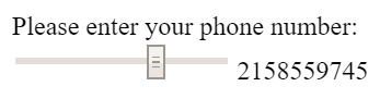
Reuse known elements, e.g. mobile users know sliders.
Notice how each digit requires precise motor control - this engages the user’s fine motor skills and creates a sense of accomplishment when they finally hit the exact pixel for “7”. The best part? If they accidentally slide past their intended digit, they get to experience the joy of precision input all over again!
Pattern 2: The KISS Principle (Keep It Simple, Stupid)
Sometimes the most elegant solution is the most obvious one. Why reinvent the wheel when you can just… make the wheel square? This pattern demonstrates the beauty of minimalism taken to its logical extreme.
Make it simple, stupid.
This implementation embraces the single responsibility principle - each button has exactly one job, and by golly, it’s going to do that job whether the user wants it to or not. The auto-incrementing feature saves users from the cognitive burden of remembering what number comes after 5.
Pattern 3: Gamification Through Random Rewards
Psychology tells us that intermittent reinforcement creates the strongest behavioral patterns. That’s why slot machines are so effective! Why shouldn’t phone number input be equally addictive?
Make your users addicted to your UI by gambling.
This brilliant implementation combines the thrill of chance with the mundane task of data entry. Each click might give you the digit you want, or it might not - that’s what makes it exciting! Users will keep clicking, driven by the same psychological mechanisms that keep people pulling slot machine levers. It’s engagement at its finest.
Pattern 4: The Specification-Driven Approach
As backend developers, we love our specifications. Why should file uploads be any different? This pattern teaches users about the importance of constraints and boundary conditions - valuable life lessons wrapped in a user interface!

Remind them of their last job application: do not use files larger than 5 megabyte (even in 2016).
Notice the beautiful simplicity: instead of automatically compressing files or providing helpful suggestions, we simply reject anything that doesn’t meet our exact specifications. This teaches users the valuable skill of reading error messages and builds character through repeated failure. It’s like pair programming with the universe!
Pattern 5: Semantic Clarity Through Exhaustive Enumeration
Ambiguity is the enemy of good software. When asking for user input, why leave anything to interpretation? This pattern demonstrates how to achieve perfect semantic clarity by listing every possible option.
Be clear in what you want to know from the user.
This approach eliminates all possible confusion by providing a comprehensive dropdown of every conceivable relationship status. No more wondering whether “In a relationship” means the same as “Taken” - we’ve covered all edge cases! The scroll wheel gets a real workout, which is excellent for developing thumb strength.
Pattern 6: Mathematical Precision in User Input
Why settle for boring decimal input when you can educate your users about important mathematical constants? This pattern combines learning with utility - it’s like Khan Academy, but for phone numbers!
Everybody loves pi, note great visual help with color and boldness.
The genius of this implementation lies in its educational value. Users don’t just enter numbers - they learn about π, e, and other mathematical constants! The visual highlighting helps users identify exactly which digit of π corresponds to their desired phone number digit. It’s gamified learning meets practical application.
Pattern 7: Sensory-Rich Interaction Design
Modern UX is all about engaging multiple senses. Why limit yourself to visual feedback when you can create a truly immersive experience?
Visuals are always great for the user.
This pattern leverages the power of visual metaphors to create intuitive interactions. Users can literally see their phone number coming to life through interpretive dance and abstract art. It’s like Kandinsky met Fibonacci and decided to revolutionize form input! The spinning animations also help users develop their spatial reasoning skills.
Pattern 8: Nostalgic Design for Cross-Generational Appeal
In our rapidly evolving digital landscape, sometimes it’s important to remember our roots. This pattern creates an authentic experience that bridges generational gaps by embracing the aesthetic choices of a simpler time.
Retro style attracts the hipsters and the old alike. Don’t forget a font style directly from a WW2 era typewriter.
The terminal-style interface instantly communicates authenticity and technical sophistication. The monospace font ensures perfect character alignment, while the green-on-black color scheme reduces eye strain (or increases it, depending on your perspective). It’s like pair programming with your grandfather’s IBM mainframe!
Pattern 9: High-Performance Input Validation
For users who find regular form input too slow-paced, this pattern provides the adrenaline rush of high-speed data entry. It’s perfect for power users who want to test their reflexes while providing basic information.
Gamification that targets Ritalin consumers.
This implementation combines the best aspects of mobile gaming with essential form functionality. The rapidly changing interface keeps users alert and engaged - no more boring static forms! It’s like playing Flappy Bird, except instead of navigating a bird through pipes, you’re navigating your attention span through a phone number field. The constant motion ensures users stay focused and prevents the mind from wandering to unimportant things like “completing the task efficiently.”
Conclusion: Revolutionizing User Experience Through Backend Thinking
These patterns represent a paradigm shift in UX design - moving away from the outdated concept of “user-friendly” interfaces toward more challenging and intellectually stimulating experiences. By applying the same rigorous thinking we use for algorithm optimization and database normalization, we can create interfaces that truly test the user’s commitment to their goals.
Remember, the best user interfaces are like the best code: they make the user think, they follow unexpected patterns, and they occasionally crash in spectacular ways that teach valuable lessons about edge case handling.
I hope this guide has given you creative input on your next UX/UI design project. Your users will thank you… eventually… after they figure out how to use it.
Got ideas for more patterns? Write me at gerrit.gruben@gmail.com.
Sources
- Images and webms were collected from 4chan’s /g/.